The smartest AI ideas, in your inbox
Get the smartest, weirdest, and most creative AI builds each week - from real founders, builders, and tinkerers.
The smartest AI ideas, in your inbox
Get the smartest, weirdest, and most creative AI builds each week - from real founders, builders, and tinkerers.
The smartest AI ideas, in your inbox
Get the smartest, weirdest, and most creative AI builds each week - from real founders, builders, and tinkerers.
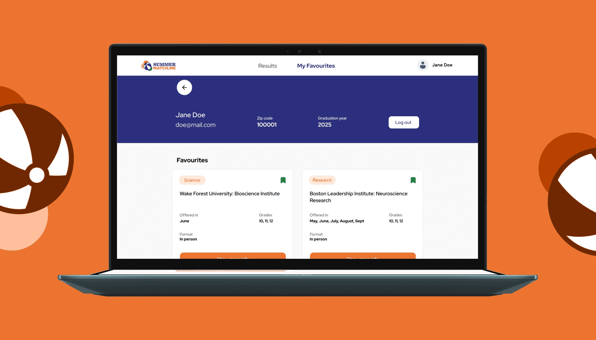
Building a property platform 10x cheaper than code that saves 10 hours a week
Industry
Real Estate
Tools
Bubble
Services
Development
Design
Property managers were losing hours every week to scattered documents, manual reminders and unreliable tenant communication, with nothing centralising any of it. We built Freeholder a platform that handles documents, automated reminders, a tenant forum, direct messaging and a smart calendar in one place. Property managers now save up to ten hours a week and the platform was delivered ten times cheaper than a coded build.


- 10 hours
Saved per week
Saved per week
- 3 months
To delivery
To delivery
- 10x cheaper
than traditional code
than traditional code
Managing property portfolios is messy: scattered documents, endless admin and poor tenant communication. Rob needed a smarter way to scale operations and engage tenants, without the cost or complexity of building it in code.

Felt like they were part of my team. They understood the problem.
Robert Lo Blue
CEO, Freeholder


The Process
The aim was a platform that does the heavy lifting for landlords, calm and admin-friendly enough that a busy property owner actually uses it. We started with discovery, mapping core needs and user types in Miro and turning them into wireframes, then designed clean, high-fidelity screens in Figma with weekly Loom walkthroughs keeping iteration fast. We built it in Bubble in under three months, with a comprehensive admin dashboard, a tenant forum and direct messaging, a smart calendar with automated reminders, and a single user dashboard for documents, contacts and discussions. The goal throughout was one source of truth that saves time and reduces friction.
The Result
The Freeholder platform now saves property managers up to 10 hours a week by automating reminders, centralising documents and giving tenants a clear voice. Admins onboard tenants in minutes, residents get a more transparent experience, and it was delivered 10x cheaper than a traditional codebase, giving the business room to scale.
Next Case Study
Launching a festival app for 250,000 people in 10 weeks
Chuck Peters' community app needed to handle Grand Old Day, a 250,000-person street festival on a single avenue, with a hard launch date ten weeks away and no margin for slipping. We built a progressive web app installed by QR code, with maps, lineups, set-time notifications and vendor-location shortcuts. Ambit went live on June 1st and attendees signed up during the event itself.
Bubble
AI
Rebuilding an edtech site in 3 weeks with zero ongoing dev dependency
Arist is an edtech company that teaches over text messages, and their team needed a clean Framer site shipped fast with no ongoing dev dependency or technical debt. We rebuilt every page, focused animation effort on the one page that earned it, structured a CMS so the team could publish on their own, and matched the migration cleanly into their workspace. Three weeks, live, no debt.
Framer
Edtech
Relaunching an AI scam-prevention service's full web presence in 8 weeks
Ask Silver's AI scam-prevention service was already in national press, but its website still looked like an early MVP, and first impressions of the site were deciding whether people trusted the product. We rebuilt the full web presence in Framer in eight weeks: homepage, business, careers, blog, legal. The site now reads at the weight of the mission, ready for the next phase of partnerships and press.
Framer
Finance
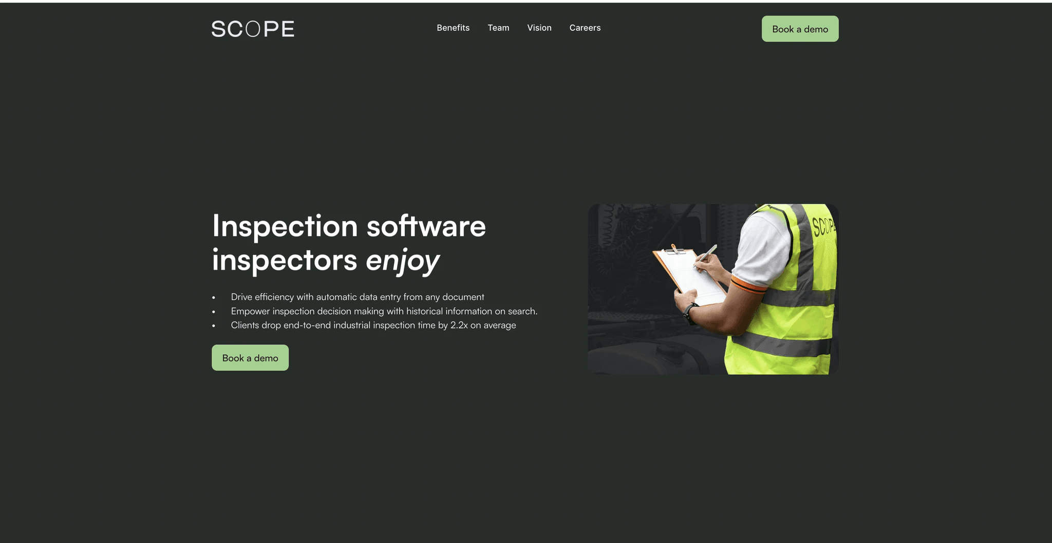
Matching 1.2M AWS professionals to roles 70% faster
The world's 1.2 million AWS-certified professionals were stuck on generic job boards where their credentials got buried and hiring managers paired right certificates with wrong seniorities. We built a niche marketplace that encodes twenty years of hiring nuance into the matching engine, surfacing strong matches first. The platform is free for professionals, runs 70% faster than the search they were used to, and verifies every profile.
Bubble
Finance
Lifting a fitness app's revenue 20% while saving 12 hours a week
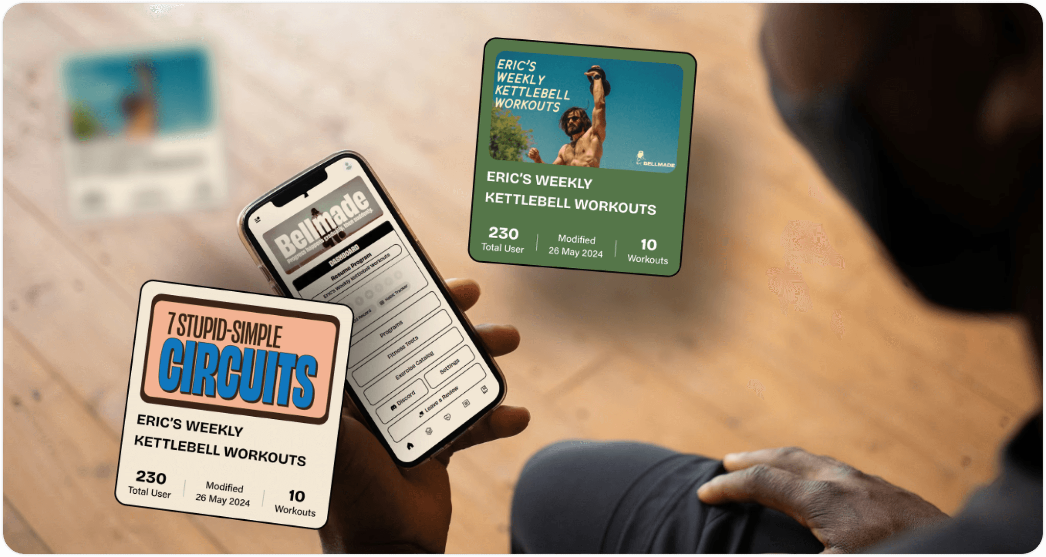
Eric Spector had built a kettlebell community around weekly classes, but running the app was eating the hours he could spend coaching and capping how he could make money from his 130,000-plus followers. We designed and built a custom app that automated the backend, sharpened the member experience and opened new revenue paths. Revenue climbed 20% in under three months and Eric got twelve hours a week back.
Bubble
Healthcare
Lifting a fitness app's revenue 20% while saving 12 hours a week
Eric Spector had built a kettlebell community around weekly classes, but running the app was eating the hours he could spend coaching and capping how he could make money from his 130,000-plus followers. We designed and built a custom app that automated the backend, sharpened the member experience and opened new revenue paths. Revenue climbed 20% in under three months and Eric got twelve hours a week back.
Bubble
Healthcare
Saving a shipping firm 10 hours a week with an app built in 2 weeks
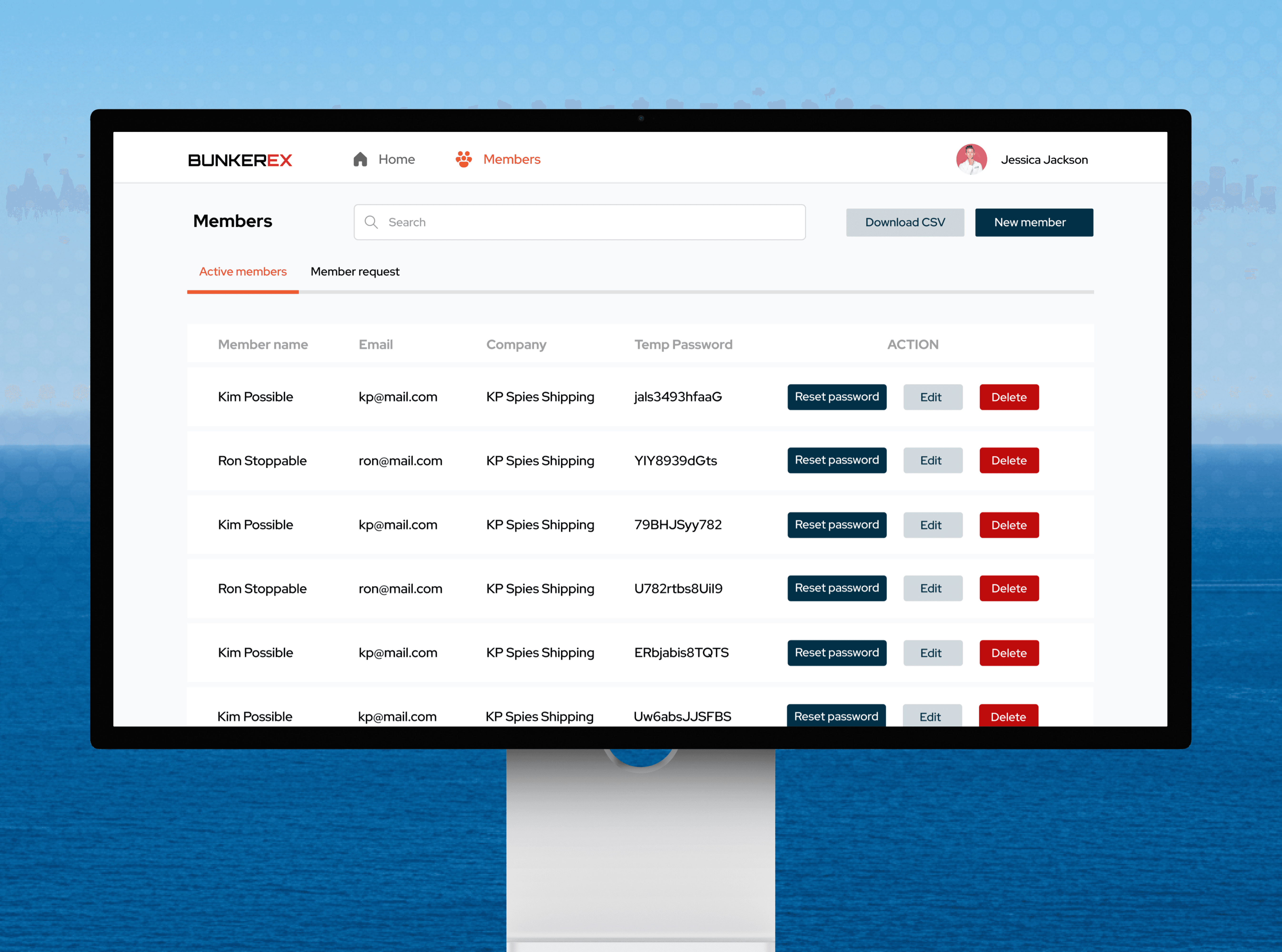
BunkerEx's shipping clients had no way to check order progress, and the team was losing more than ten hours a week manually sending updates. We shipped a native iOS and Android app in two weeks, syncing securely with their database and pushing real-time order status to clients automatically. Clients now filter their own data, admins manage from one dashboard, and the manual work is gone.
Bubble
Retail
Saving a shipping firm 10 hours a week with an app built in 2 weeks
BunkerEx's shipping clients had no way to check order progress, and the team was losing more than ten hours a week manually sending updates. We shipped a native iOS and Android app in two weeks, syncing securely with their database and pushing real-time order status to clients automatically. Clients now filter their own data, admins manage from one dashboard, and the manual work is gone.
Bubble
Retail
How a gym with no tech team shipped the Strava for heat and ice
Move is a Fulham gym built around cold and heat therapy, with a strong community and no tech team, but most people guess at the timing, skip the breathing and quit before the benefits land. We designed and built a native app with session tracking, guided breath audio and a habit system, shipping it to both app stores with no custom code. Over 5,000 sessions logged.
Bubble
Healthcare
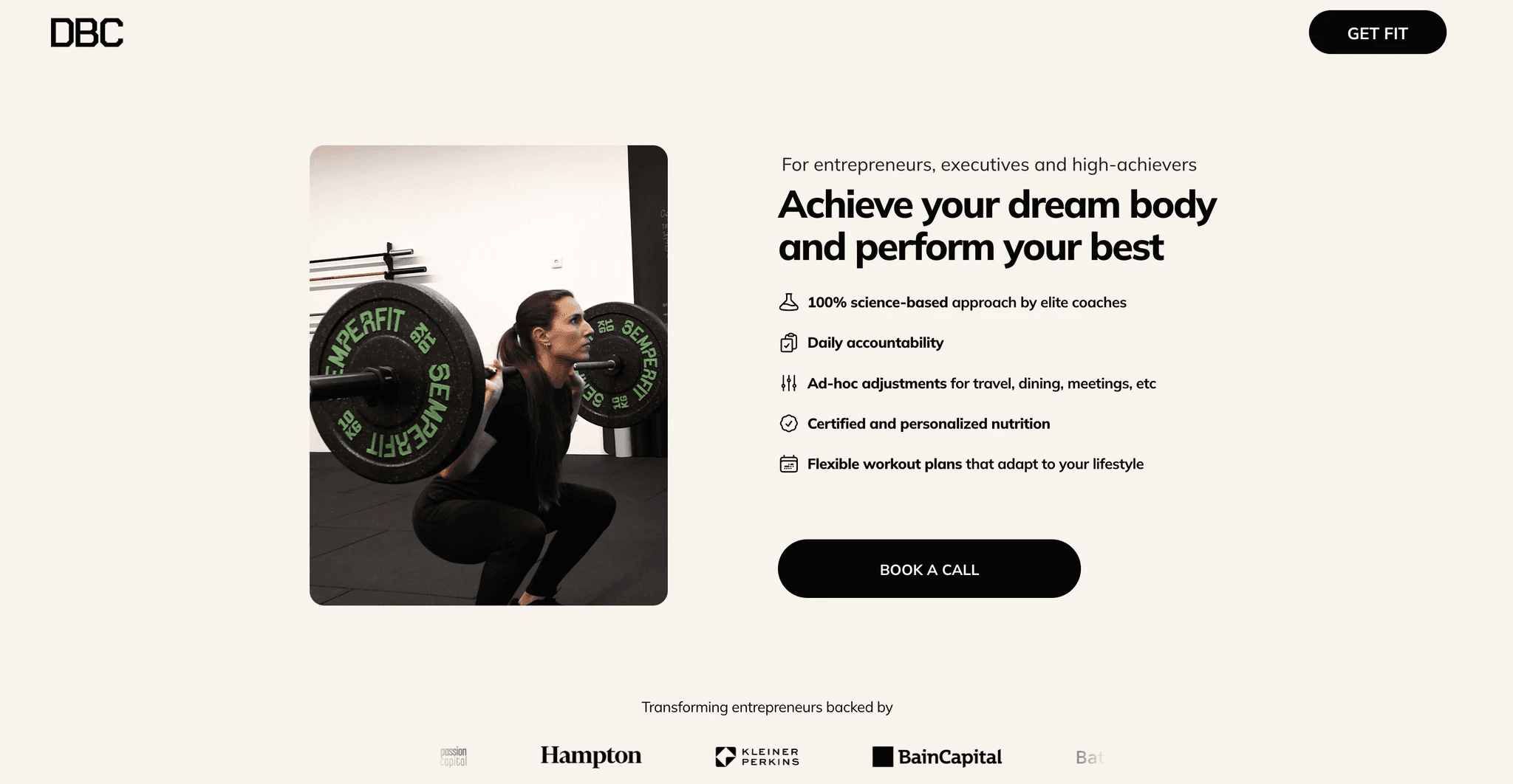
Building a premium site in 1 month that helped double growth
Daily Body Coach is a fitness concierge to top entrepreneurs whose Squarespace placeholder was lagging behind PR hits in Entrepreneur, CNN and MSN, with January's New Year rush as the hard deadline. We built a premium Framer site in a month with Calendly, Beehiiv and a restyled Ghost blog. They launched ahead of schedule and the new presence helped them double their growth.
Framer
Healthcare
Shipping 10+ products that put 10,000+ recipes online
Diaspo's mission was to unlock the cooking knowledge sitting with older adults, but two accelerator programmes had ended without a shipped product, and their users were retired chefs who needed digital tools to feel natural on day one. We led research with older adults and shipped over ten products across a marketplace, automated booking flow and storefront, winning partnerships with Spotify, Amazon and Accenture.
Bubble
Edtech
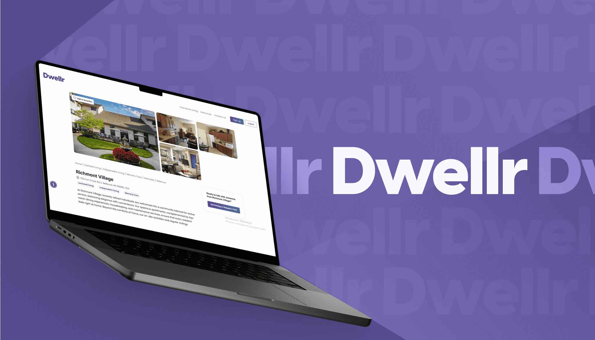
Doubling engagement for a senior-care marketplace in 2 months
Dwellr is a VC-backed senior-care marketplace whose previous agency had said key features were impossible, so the platform never launched. We took accessibility as the starting point, built an admin handover feature for users who could not create their own listings, and streamlined onboarding and messaging. Dwellr launched in two months and engagement doubled, with families finally getting a direct way to find care.
Bubble
Real Estate
Rebuilding an AI tool's site to load 75% faster, with zero SEO loss
Formula Bot's AI spreadsheet tool worked, but the Bubble-built marketing site was slow, hard to update, and underconverting for a product with real search demand to capture. We migrated to Framer while protecting every ranking, kept the backend on Bubble, and added a custom ROI calculator and animations that showed the product in action. The new site loads 75% faster with zero SEO regression.
Framer
AI
Building a gamified learning platform with 1,300+ hours of courses in 3 months
GameU teaches game design through live classes, but the platform had to serve two completely different users in one product, an eight-year-old picking a Minecraft class and a professional games-industry instructor building a curriculum. We embedded as their product team for three months, built both experiences on shared infrastructure, and shipped a custom gamification engine. The platform now delivers over 1,300 hours of courses.
Bubble
Edtech
Launching an AI travel app to 10,000 users in 5 days
Trip planning is overwhelming with endless tabs, too many opinions and never enough time, and early 2023 opened a five-day window to solve it with AI before anyone else did. We went from idea to live product in five days, with a smart onboarding flow, OpenAI generating day-by-day itineraries, and Google Maps built in. Getaiway hit 10,000 users in five days and 50,000 itineraries generated.
Bubble
AI
Launching an enterprise-ready site for a VC-backed startup in 14 days
GetScope is a VC-backed startup selling into enterprises with thousands of employees, but their placeholder site was making procurement teams doubt the company. In two weeks we mapped content for senior buyers, designed a modular system in Figma and built it in Framer with a CMS the marketing team owns. GetScope went from looking like a startup to standing in the enterprise room.
Framer
AI
Building a SOC 2-ready HR platform with security built into the data
Go Emeritus needed a complete HR offboarding platform where three very different users, current employees, ex-employees, and admins, could share one product without ever seeing each other's data. We built the permission system into the database itself, enforced at the data level, and integrated with Okta. The platform passed full pen testing and now serves multiple enterprise companies, with sensitive data locked down end to end.
Bubble
AI
Scaling one travel advisor into a platform that books a honeymoon in 24 hours
A honeymoon advisor was hand-delivering every itinerary one couple at a time, building documents and chasing separate flight, hotel and tour bookings, capping the business at her own calendar. We built Hitched, an AI planner that lets couples describe their honeymoon and confirm flights, hotels and experiences with one button. Now live as both a self-serve product and a VIP tier, featured on BetaList.
Bubble
AI
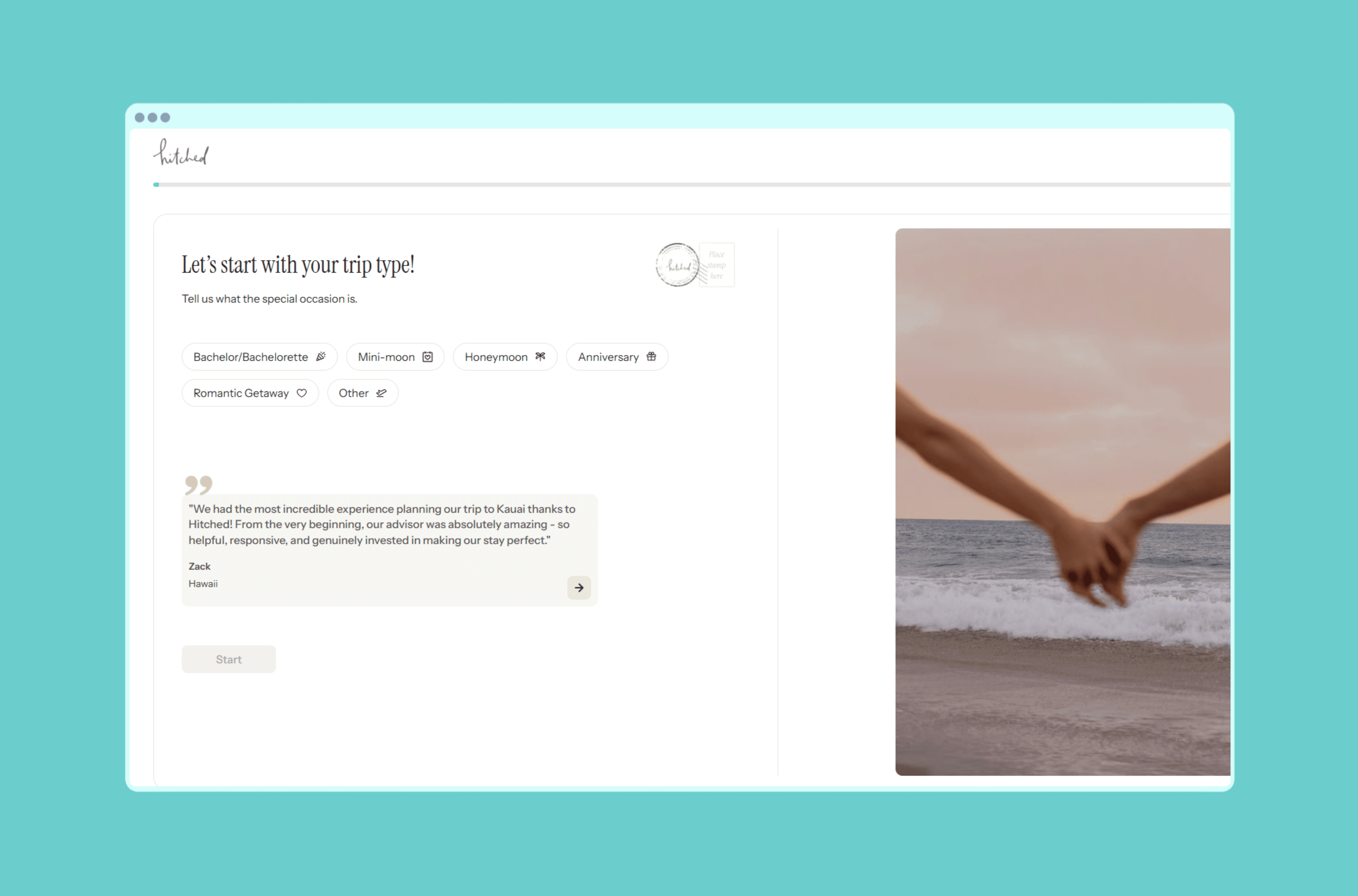
Launching Saudi Arabia's first car-service marketplace in 1 month
A venture studio had spotted a gap in the Saudi car-service market but two constraints ruled out the standard playbook from the start: Stripe is unavailable there and half the audience reads right to left. We built MerApp's RTL interface into the component system from day one and integrated Tap Payments. The platform launched in a month as Saudi Arabia's first car-service marketplace and crossed 1,000 users.
Bubble
Automotive
Cutting a leading AI startup's costs in half in 3 weeks
MyAskAI is one of the leading AI startups, and as they scaled, their platform's CPU costs were doubling and slowing the APIs that powered their product. In three weeks we tuned the highest-impact frontend pages and rebuilt the backend around intelligent caching, sharper queries and a cleaner data flow. Costs dropped by half, the platform runs roughly twice as fast, and the headroom is now there to scale.
Bubble
AI
Taking an AI newsletter platform from idea to live SaaS in 3 months
Nuzely started as a Lovable prototype for an AI newsletter platform where anyone could generate, publish and monetise content, but the founder knew it would not scale that way. We defined v1, mapped both sides of the platform, and built the MVP in Bubble with Stripe revenue share, public creator pages and reliable delivery. The product went from prototype to live SaaS people sign up and pay for.
Bubble
Framer
AI
Building a UK tax platform people actually trust
Penny Ledger wanted to make UK self-assessment tax returns painless, answer guided questions, get matched with an accountant, file with HMRC for a flat fee, but the half-finished Bubble build was nowhere near ready to ask people to trust it with their money. We built the full lifecycle as one guided experience and passed a full pen test. The platform is now live, no phone call needed.
Bubble
Finance
Cutting 3 hours of daily admin for a new kind of vet practice
A membership vet practice in London was losing three hours every morning to manual subscription pulls, hand-filtered dispatch lists and emails sent before clinical work could begin. We built Pickles a platform wired straight into Covetrus, Zoetis and Stripe, handling bookings, prescriptions, dispatch and flexible billing in one place. The three hours of daily admin are gone, and a second clinic is on the way.
Bubble
Healthcare
Shipping the MVP that helped Pockla raise £1.6M
Pockla had a vision for blending AI and creative strategy for social marketers, no time to spare and no product yet, and they needed product-market fit fast. We joined as an embedded teammate, building the MVP in Bubble across design, n8n automations and Slack integration with daily Loom updates. The working product gave them the traction to close a £1.6M seed round backed by the Sidemen.
Bubble
n8n
AI
Tripling demo submissions for an artist-first record label
Polaris Records launched with an artist-first mission but no platform behind it, so demo submissions were a mess and the brand was hard to find online. We designed and built a brand-led Framer site with a clean submission portal, artist pages and a space-themed identity. In the weeks after launch, traffic doubled, visitors stayed twice as long, and demo submissions tripled.
Framer
Media
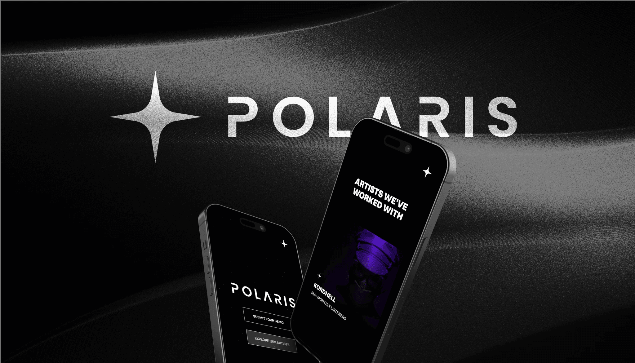
The booking platform magicians trust, including the ones who perform for royalty
ProMagic had a prototype that proved magicians would pay for a real platform, and the world's largest magic convention as an immovable February deadline with a room full of buyers waiting. We mapped the workflow, designed something clean over a dated competitor set, and shipped a full booking pipeline, invoicing and Stripe payments in three months. The platform launched on time and sold to 100 paying magicians across the UK and Europe.
Bubble
AI
Shipping an AI SEO platform across 8 LLM providers in 4 months
A first-time founder had spent thousands on slow SEO agencies and hours every month on in-house alternatives, and wanted an AI platform that runs the whole job across eight LLM providers on its own. We prototyped the AI Visibility feature in Replit, built in Cursor with n8n orchestrating the backend, and shipped to beta in four months with full subscriptions and a clean documented handover.
Cursor
n8n
AI
Launching a B2B-ready site for a venture-backed marketplace in 6 weeks
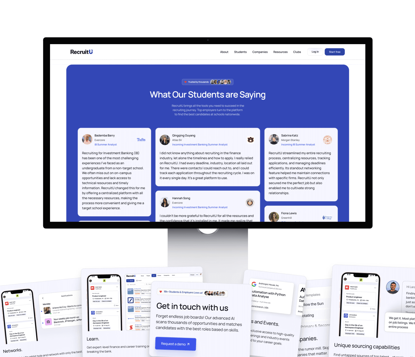
RecruitU is a venture-backed marketplace connecting Harvard students to firms like Blackstone, but the website led with the student journey and buried the B2B side that drives growth, with no product visuals to start from. In six weeks we ran a discovery sprint, designed twenty product mockups from scratch and shipped seven responsive Framer pages. The growth side of the marketplace finally has a front door.
Framer
AI
Launching a B2B-ready site for a venture-backed marketplace in 6 weeks
RecruitU is a venture-backed marketplace connecting Harvard students to firms like Blackstone, but the website led with the student journey and buried the B2B side that drives growth, with no product visuals to start from. In six weeks we ran a discovery sprint, designed twenty product mockups from scratch and shipped seven responsive Framer pages. The growth side of the marketplace finally has a front door.
Framer
AI
Helping an NVIDIA-backed AI unicorn ship new pages as fast as it ships models
Reka is an NVIDIA-backed AI unicorn that ships frontier models constantly, and every model launch needs a landing page, solution pages and assets ready the day it goes out. We are their entire design and dev team, working off a single visual system flexible enough to ship for any audience fast. New product pages now go live the day of announcement, with the engagement extended.
Framer
AI
Building an AI sales coach that turns your best rep into the whole team's playbook
Every sales leader has the same problem, their best seller closes far more than everyone else and there is no way to clone them, and most AI sales coaches fail because real customer data is messy. We built SizzleKick's AI inside Salesforce with a field-mapping system that unlocks any custom setup. The product is AppExchange-certified, and companies once too complex to onboard are now paying customers.
Bubble
Framer
AI
Going from idea to a launched product in 4 hours with AI
For the Bubble AI Challenge, we set ourselves a real-time question: how fast can a team go from nothing to a working live product? In four hours we shipped Slapshots, a tool that turns product screenshots into polished mockups, built on BubbleAI with the Mockuuups API and Figma screens converted directly. Proof that AI tools and a focused team rewrite what speed means in software.
Bubble
AI
Turning a one-developer prototype into a retail-media platform built to scale
The Shopper Group's retail-media platform had been built by one person, stacking features on features, and was about to be pitched to clients in London and Australia. We rebuilt it on new architecture and shipped Plan Pilot for cost modelling, Asset Hub for campaign assets and Benchmark Optimizer for performance, all on a mobile-first design system. It now runs in daily use by brand owners across markets.
Bubble
Retail
Automating 6 manual operations for a 2,000-consultant marketplace
Stratverse is a premium consulting marketplace placing specialists into projects at Bain, McKinsey and Google, but every match, contract and invoice was being done by hand and the model could not scale that way. We built a platform that codifies their matching logic and automates the full workflow from sign-up to invoicing. Six manual operations are now automated, saving the team over forty hours every week.
Bubble
Framer
Finance
Building the AI edtech engine that got acquired
Ambitious high school students were defaulting to generic summer options because thousands of programs, internships and volunteer choices made every decision overwhelming. We built SummerMatch's AI coach with a conversational flow and a matching engine across programs, internships and community service. It drew over 20,000 visits and the company behind it got acquired, with our platform now the foundation for a larger education group.
Bubble
Edtech
Rebuilding the website behind a $4.8B venture platform
Sydecar had just raised a Series A and was scaling a venture platform handling billions in assets under administration, but their website had been stitched together from freelance handoffs and was eroding trust before anyone booked a demo. We rebuilt it as a system in Framer with reusable templates, CMS collections and interactive calculators. The team now runs ten times more growth experiments across fifty rebuilt pages.
Framer
Finance
Stabilising a cloud GTM platform to zero major incidents
Symbio's cloud partnership platform was live and starting to strain, with slow load times, breaking registration and unreliable dashboards, none of it critical alone, but together it was eroding client trust. We reworked the loading logic, restored complete dashboard data and cleared the long tail of smaller issues, without a rebuild. The result was zero major incidents across the engagement, on a platform their team now runs themselves.
Bubble
AI
Taking a 10-billion-view music brand to #1 on Google
The Nations runs some of YouTube's biggest music channels with over 10 billion views, but their web presence did not reflect that, and artists struggled to find them. We rebuilt the brand and site in Framer with custom-coded components, immersive animation and a streamlined submission form. Artist submissions doubled, the site climbed to the top spot on Google, and it was nominated for Framer's Site of the Year.
Framer
Media
Launching a social travel app that tags every place with 98% AI accuracy
Travel recommendations online come either from strangers or stripped of context, with maps showing pins and review sites showing ratings, and neither telling you whether a place actually fits the vibe you want. We built Vela, a social travel app where recommendations come from people you trust and AI tags every place at 98% accuracy. Now live across eight cities including Dubai, Paris, London and Bangkok.
Bubble
AI
A Boeing-backed air taxi, nominated for a Webby vs Apple and Google
Wisk is building a Boeing-backed autonomous passenger aircraft with $500M+ in funding, and the conversations with investors and regulators were already happening, but the old website did not carry the weight of the company behind it. We designed and built a cinematic, scroll-driven Framer site from scratch in two months. It was then nominated for a Webby Award for Best Business Website, up against Apple and Google.
Framer
Automotive
Unlocking 10x more growth experiments for a Series B edtech
Zen Educate is a Series B edtech operating across the UK and US whose existing site was slow to update, hard to maintain and blocking growth experiments. We migrated to Framer page by page with zero downtime, built UK and US variant components, and rewired the full marketing stack from GTM to Zoho. Their team now runs ten times more growth experiments without engineering involvement.
Framer
Frequently Asked Questions
How does no-code actually compare to traditional development on cost?
Freeholder shipped 10x cheaper than a traditional codebase, in under three months. The cost difference comes from speed of iteration and not paying for a backend team to maintain code that doesn't need to be custom. The savings are real when the use case fits.
We have multiple user types with different needs. How do you handle that in one product?
Freeholder has property managers managing portfolios and tenants who need transparency. We mapped both user flows in discovery before designing a single screen. The platform serves both without making either feel like an afterthought.
We don't want to spend forever in design rounds. How do you keep things moving?
For Freeholder, weekly Loom walkthroughs kept everyone aligned and allowed for rapid iteration. Feedback flows in async, decisions get made fast, the next iteration ships. Long design cycles usually hide unclear decisions, not real work.
We're saving time but tenants need a real way to communicate. Can the platform handle that?
Freeholder has a tenant forum, direct messaging, and an automated reminder system. The tools that save the property manager time are the same tools that give tenants a clear voice. Both sides win when the platform is designed for both.
How does discovery work for a SaaS like this?
We started with discovery sessions to map needs and user types, built flows on Miro together, then turned those into low-fi wireframes. By the time design started, the product logic was settled. Discovery is where the build stops being expensive.