
Best Education Landing Pages Built with Framer
Best Education Landing Pages Built with Framer
Best Education Landing Pages Built with Framer

Founder of Goodspeed
For education platforms, a landing page often serves as the first point of contact with potential students, making it crucial to establish trust and guide users toward the next step.
Goodspeed builds high converting education landing pages on Framer. As a Framer Enterprise Expert with a 5.0 Clutch rating and an Agency of the Year award, we turn traffic into signups, not just pretty pages. See our work on the Framer developers page or book a free consultation.
This article highlights top education landing pages built with Framer, showcasing how simple, effective design can increase engagement and conversion. For a broader selection, explore our comprehensive Framer Landing Page Examples.
From universities to online learning platforms, these examples demonstrate how smart layout choices, clear messaging, and user-centric design help meet the unique needs of education-focused audiences.
Whether you’re working on admissions, course promotion, or a learning platform, these examples can offer practical, actionable inspiration.

Best Education Landing Pages Built with Framer
Best Education Landing Pages Built with Framer
1. Dive

Dive features an immersive layout with clean typography and fluid animations that guide users seamlessly through content. Interactive elements and bold visuals reflect a dynamic approach to continuous learning, while the structured navigation enhances user flow without overwhelming the experience.
2. CO-UX
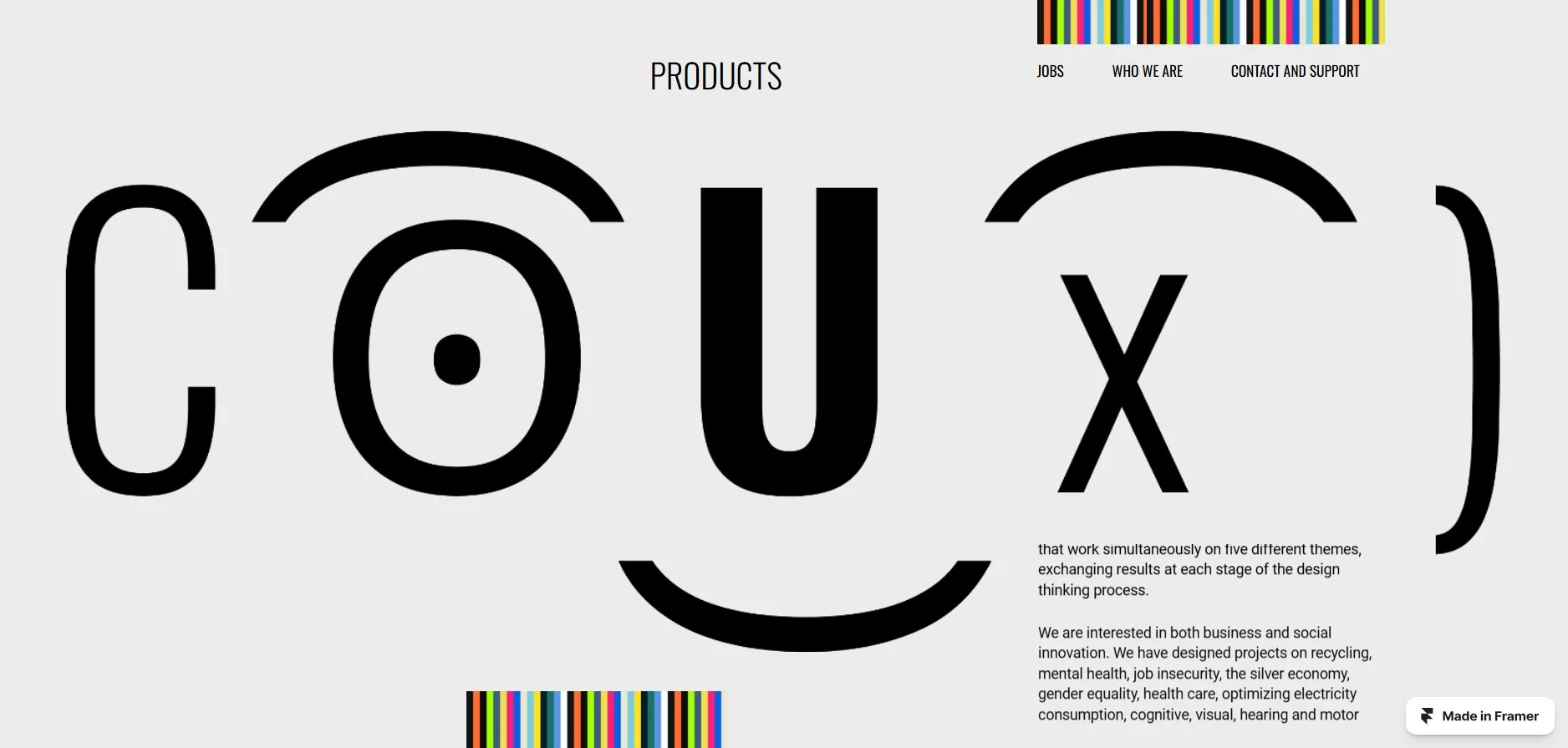
CO-UX leverages a minimalist design with a well-organized grid structure. Subtle hover effects and precise typography hint at a focus on collaborative growth, while the clear information hierarchy allows users to engage with content effortlessly. The balance of whitespace ensures clarity and ease of reading.
3. Aramis Mentorat
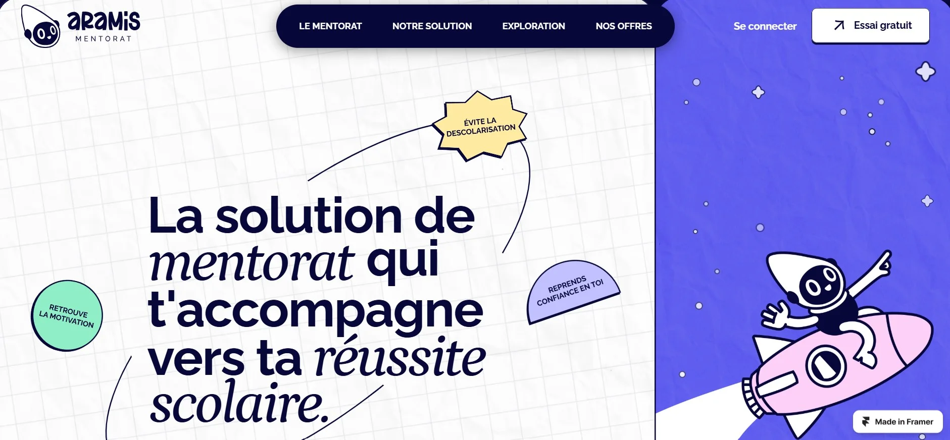
Aramis Mentorat presents a clean, approachable layout complemented by soft color schemes and thoughtful iconography. Its clear call-to-action buttons and concise content structure subtly convey an emphasis on personal guidance and skill development. Interactive elements and a guided user flow help streamline the mentorship process.
For education platforms seeking to create similarly impactful designs, partnering with our Framer agency- Goodspeed can provide the expertise needed to achieve exceptional results.
4. Blaze Type Guide
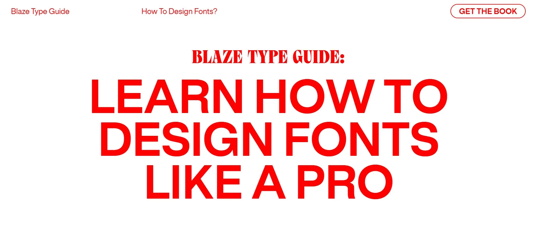
Blaze Type Guide embraces bold typography and dynamic layouts that naturally draw attention to key concepts. The interactive sections provide an engaging exploration of design principles, with smooth transitions that support a visually stimulating and informative experience. Clear call-to-action buttons further enhance user interaction and guide them seamlessly through the content.
A well-designed education landing page balances clarity, engagement, and usability. The examples we've explored demonstrate how design can subtly communicate the core of an educational offering while enhancing user engagement. From bold visuals to intuitive navigation, each example showcases how thoughtful details make learning platforms more effective.
Considering a similar project? At Goodspeed, we've collaborated with global clients to craft impactful digital experiences. Book a call with us-we'd love to discuss your ideas and share insights that could shape your next project. No obligations, just a productive conversation.

Written By
Harish Malhi
Founder of Goodspeed
Share this article
Calculate How Much Your Site Will Cost
Calculate How Much Your Site Will Cost
Calculate How Much Your Site Will Cost
The smartest AI ideas, in your inbox
Get the smartest, weirdest, and most creative AI builds each week - from real founders, builders, and tinkerers.
The smartest AI ideas, in your inbox
Get the smartest, weirdest, and most creative AI builds each week - from real founders, builders, and tinkerers.
The smartest AI ideas, in your inbox
Get the smartest, weirdest, and most creative AI builds each week - from real founders, builders, and tinkerers.
Get in touch
Ready to Build Smarter?
Got a sketch, a strategy, or a full product roadmap? if Framer's in the plan, we’re the people to help.
Book a call below – We’ll help you make the smartest next move.


We’ve created products featured in


Get in touch
Ready to Build Smarter?
Got a sketch, a strategy, or a full product roadmap? if Framer's in the plan, we’re the people to help.
Book a call below – We’ll help you make the smartest next move.
We’ve created products featured in